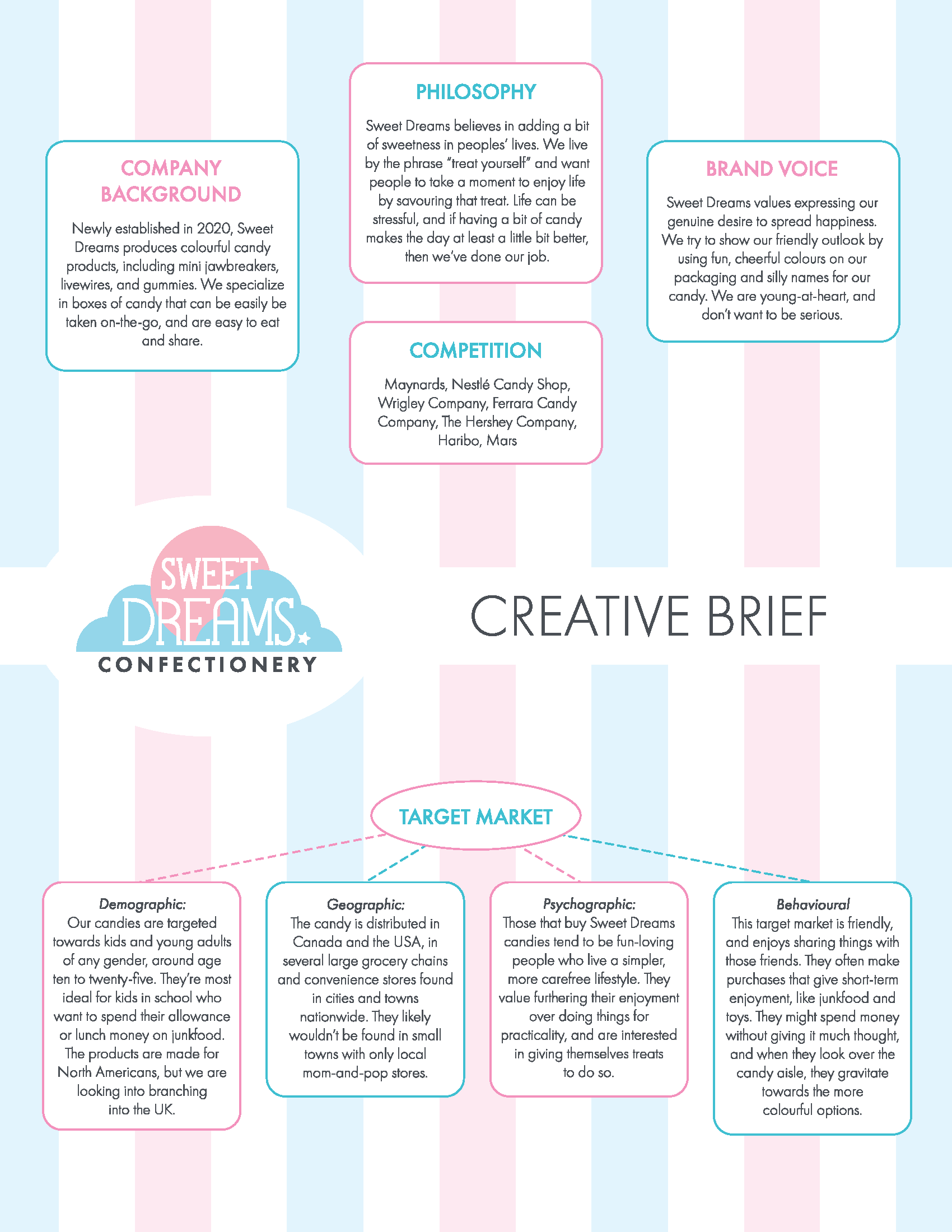
Sweet Dreams Confectionery

For my Advertising, Packaging and Promotion class, I came up with the fictional brand "Sweet Dreams Confectionery". My goal was to create three packaging designs for candy, that are print-ready and functional. The three designs should be of three different shapes, but look cohesive together. To achieve this, I developed a creative brief and a brand guide as a foundation for the packaging.

The Creative Brief

On the creative brief, I described the company's background, their philosophy, their brand voice, their competition, and their target market. It's important to delve into more than just the looks of the brand, and consider the feelings and values they want to convey, as it all plays into the design.

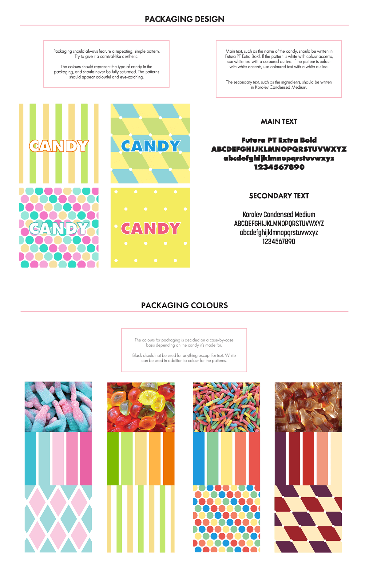
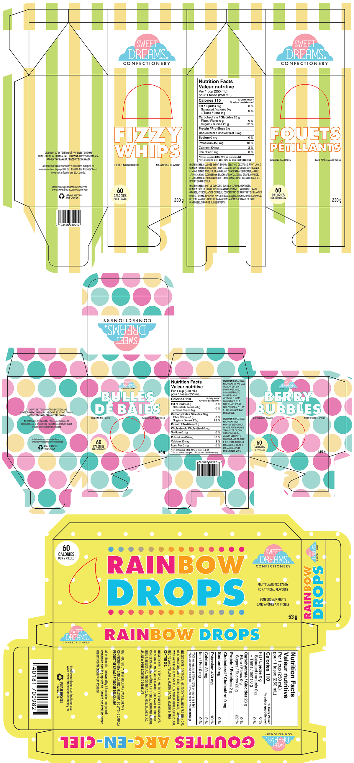
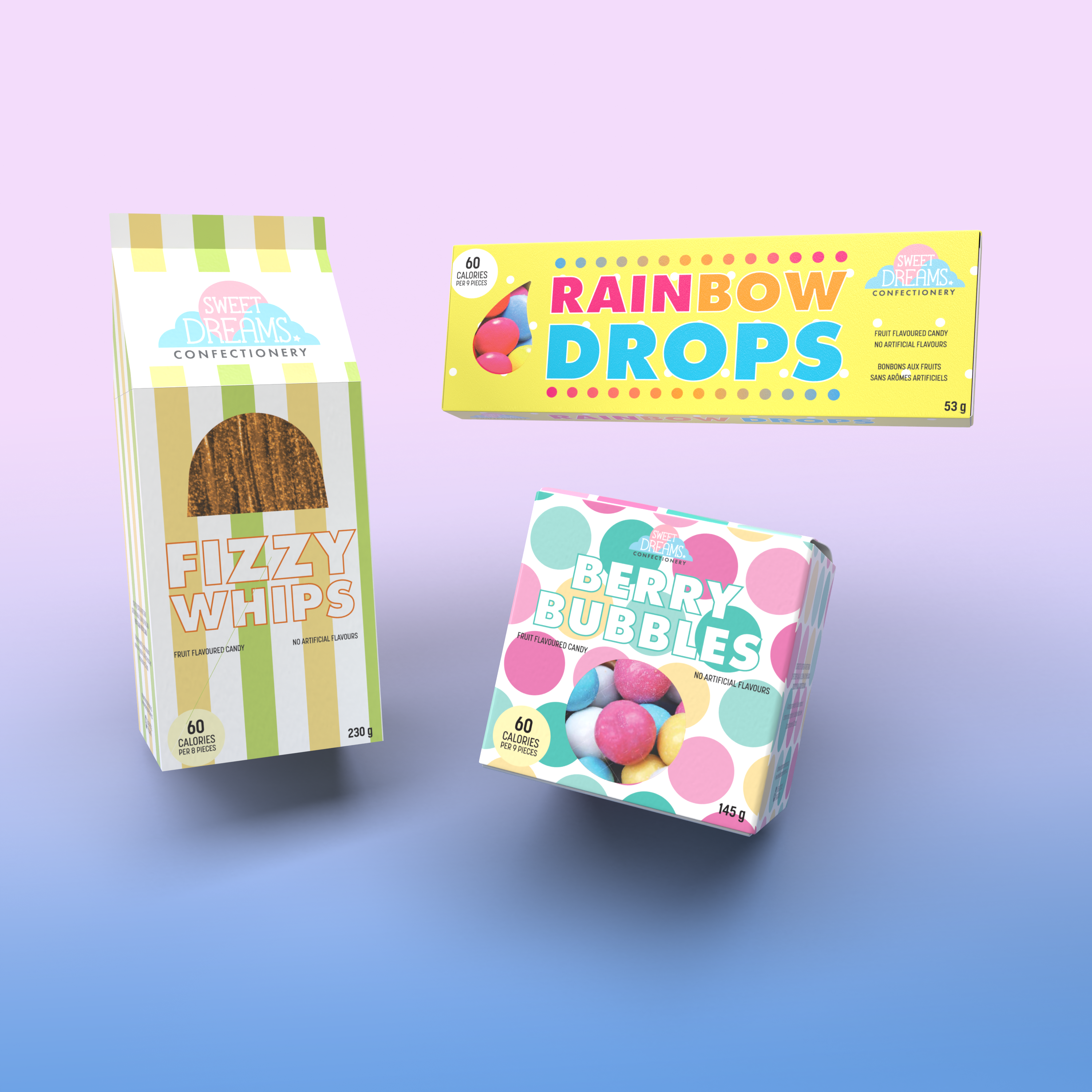
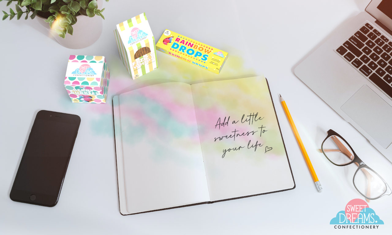
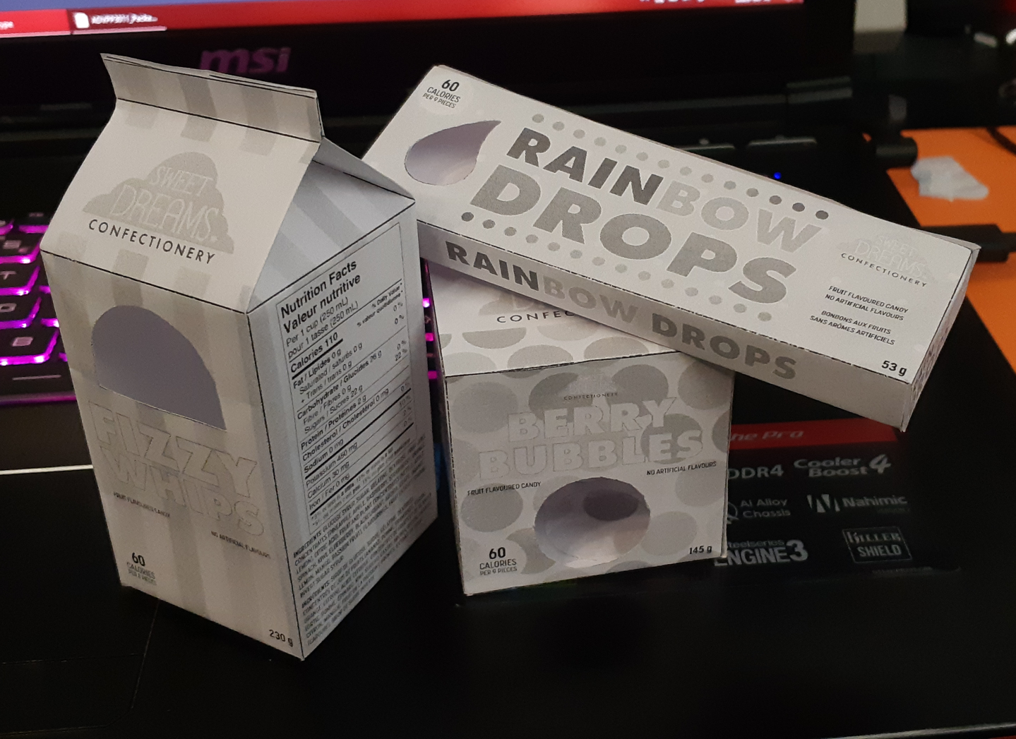
Sweet Dreams' target demographic focuses on kids and youth. The idea behind it came largely from when I used to work in a convenience store, and the students that came for lunch would buy candies instead of proper food. It's often purchased using their allowance or lunch money and shared among friends. I designed the colourful, playful packaging and product names to attract attention.

Creative Brief for made-up candy company Sweet Dreams Confectionery
Brand guide for Sweet Dreams Confectionery explaining how to design candy packaging.

The Brand Guide

The first couple pages of the brand guide explains the usual logo colours and breakdown. The part that makes the brand guide unique is how it describes designing candy packaging. I described how there should be a simple repeating pattern across the whole package, reminiscent of a carnival. This pattern also decides how the text should look: coloured patterns with white accents use coloured text with a white outline, and patterns that are white with coloured accents, use white text with a coloured outline. When it comes to the colours themselves, I decided that they should be largely based on the colours of the candies inside.

By making these guidelines, the design remains consistent while allowing for each candy's packaging to still be unique.

Packaging Designs

I researched different box shapes when I was creating the packaging. I settled on a milk carton shape, a cube, and a long, flat box, keeping in mind the types of candies that would go inside and where in the store they would be displayed.

There are several things you have to remember when designing for print. For example, I included adequate bleed for any part of the design that is meant to print edge-to-edge. Each box also has a unique die-cut, which is outlined in a unique spot colour to indicate where to cut.

It was an interesting challenge figuring out how to arrange all the information, as some information is mandatory on food packaging in Canada so I needed to factor it into how everything should be arranged. The ingredients, nutrition facts, calories, and bar code all need ample space to ensure legibility and to avoid getting cut off by folds or edges.

Sweet Dreams Confectionery packaging designs.

The Final Product

In the end, I managed to come up with three practical candy package designs, and in addition to successfully printing them out and folding them into boxes, I also mocked them up on 3D models. I created an advertisement for them using these 3D models.