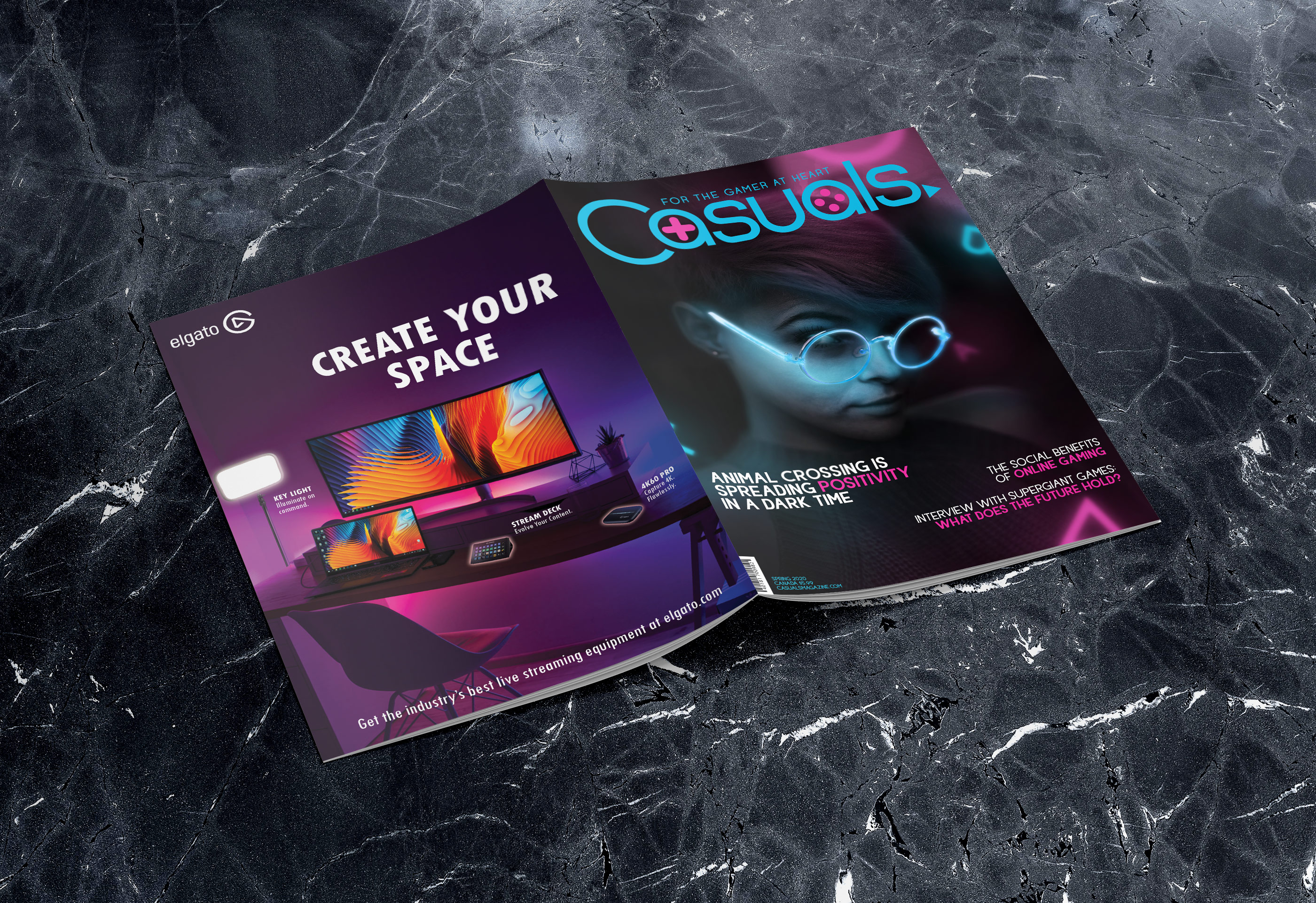
Casuals Magazine

"I’ve proudly called myself a gamer since I was very small, when I would try to convince my older brother to play the Sega Genesis with me. Ever since then, my love of games has never faltered, and I still make sure to fit in time for gaming in between my work.

Casuals is built on a love for games that countless people share, deep in their hearts. I wanted to create a magazine that collected articles and stories from the feel-good side of gaming, rather than the intense, competitive side that is more popular in the media.

I also wanted to show support for the people like me that don’t identify as a hardcore gamer, but believe that it doesn’t make us any less of an appreciator. We exist, and we have wonderful tales to tell!"

- Letter from the Editor

The Pitch

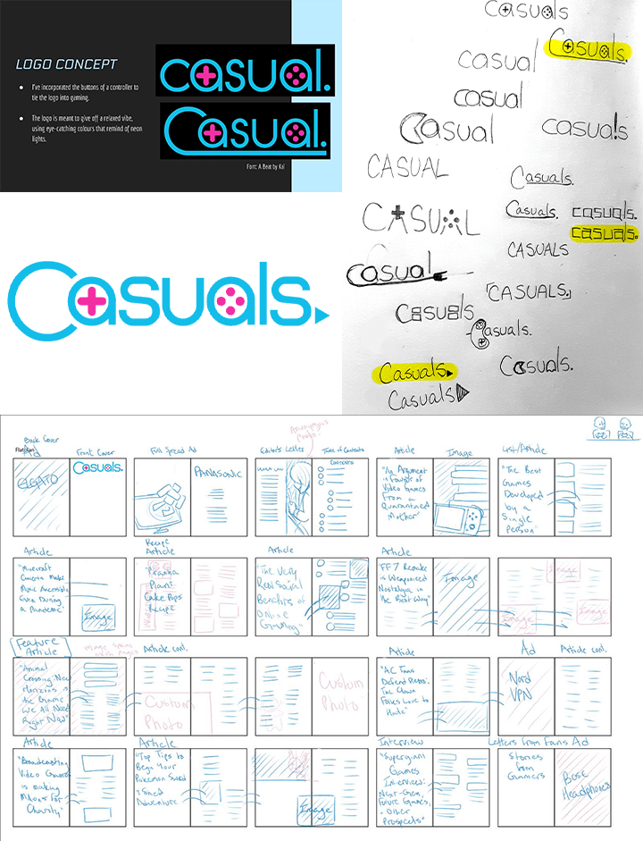
The magazine's name is a play on a term typically used by “hardcore” gamers as an insult towards people that play games at a more leisurely pace. I chose this phrase for the name of the magazine as a cheeky way of showing pride as a casual player.

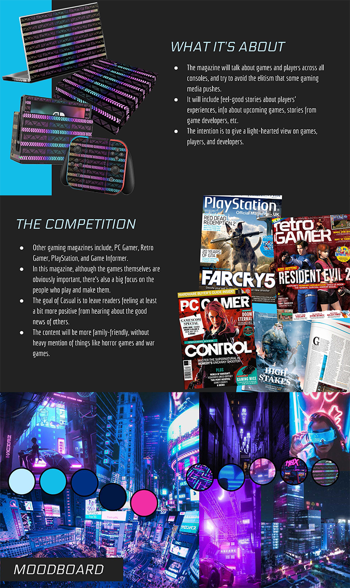
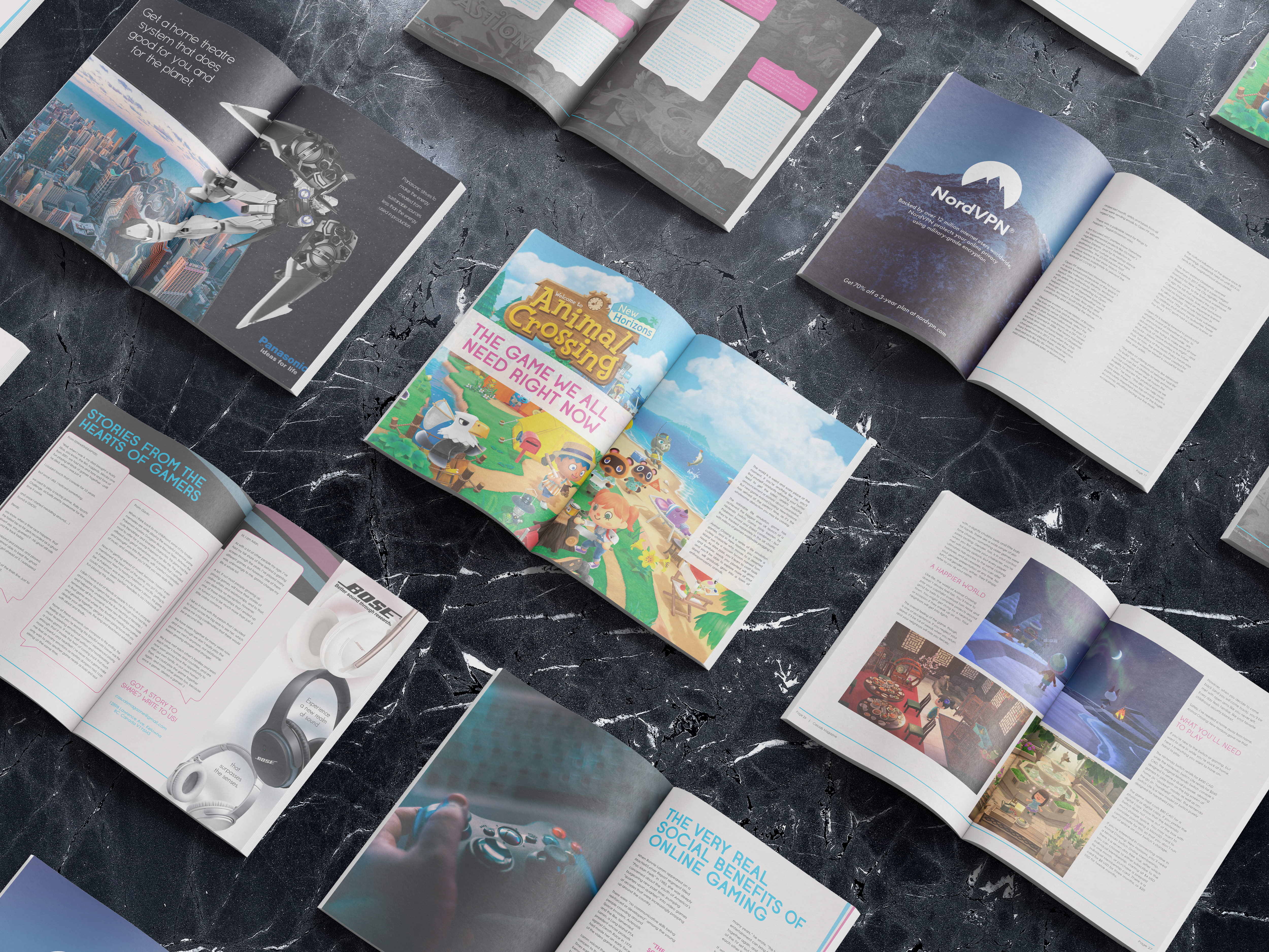
The intention behind the magazine was to show a different side to gaming than the intense one that's usually shown in media. There's a massive community of friendly players in the world that have a casual approach towards games, focusing more on storytelling, characters and gameplay rather than competition.

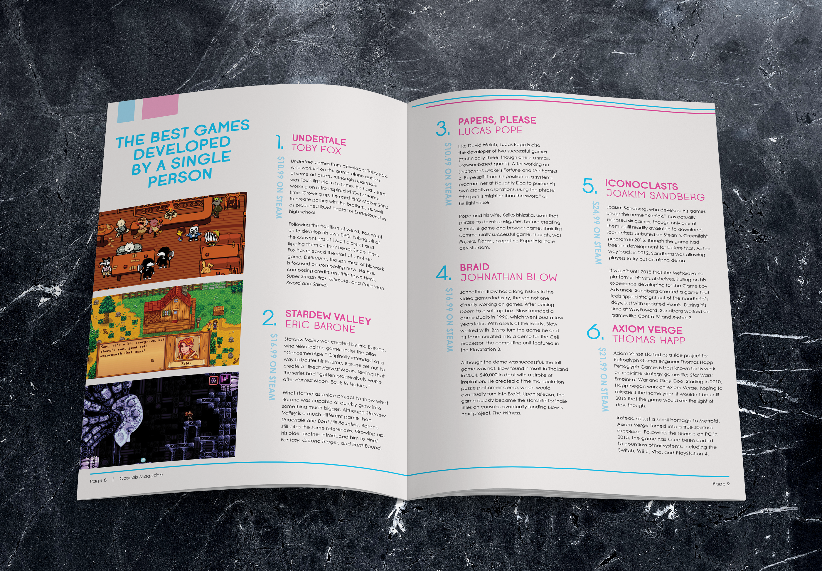
Content ideas included articles which talked about the stories behind games, their players, and their developers, and are aimed towards feel-good and heart-felt content that gives you that warm, fuzzy feeling after reading them. I also had plans for a section where readers would send gaming-related stories that stood out to them in their lives.

Original concept ideas for Casuals magazine, including the a summary of the topics, the competition, and a moodboard.
A persona for the typical Casuals magazine reader.

Target Demographic

Casuals' target market is defined as anyone aged 16-35, typically not of high income, with a pretty liberal point of view. Typical readers would likely be from cities, with ample internet and video game access, likely spending quite a bit of time on social media. They are people with a positive attitude, who are curious and friendly, open-minded and laidback. Obviously, they are interested in games, but particularly in their stories and characters, as they like to keep up to date on them. They may be introverted, and may be satisfied just seeing a game rather than playing it themselves.

This target demographic research led me to creating the Casuals persona. Meet Maddy, a twenty-four year old college student. As a starving student, she may not be able to afford many games herself, but she loves to see content creators play them. She's an optimist, and when she's not working hard in school, she's relaxing by playing video games. The typical games she plays are turn-based RPGs and management sims. Mostly, she plays games on her Nintendo consoles and her PC. Her behaviour on social media and general personality make Maddy the ideal Casuals reader.

Early Concepts

From a handfull of rough sketches, I developed a logo I quickly fell in love with. It utilizes the blue and pink brand colours, controller button symbolism, and a play button for a period. The original magazine idea was named simple "Casual", but after receiving feedback it changed to "Casuals", leaning into the community focus of what it's written about.

The flatplan was tricky as I was limited to forty pages. I had to consider the prime real estate for advertisements, such as the back cover and inside cover, as well as fit the lengthy feautre article relatively closes to the center of the magazine. I had to keep in mind dynamic page layouts as well as logically flow articles from page to page. In the end, some articles proved to require more pages than planned, and so other articles were cut.

Early logo sketches of the Casuals logo, plus the flatplan for the magazine.

Designing the Branding

Creating an in-depth brand guide was rather new to me at the time of making it. I had made brand guides focusing on logo structure and usage several times before, but having the freedom to decide the magazine's branded look was fun. The brand guide not only includes logo usage, but also a description of the target demographic, how to design the covers, typography throughout the magazine, and how to choose suitable photography and images.

Once I had determined the vibe of the magazine, it wasn't too hard describing how it should be created. As the magazine has a lax nature, I decided there should be some leniency in how the magazine should be built. Allowing logo variations (as long as they remained within the brand colours) and having photos follow a loose palette made it so that I could build the magazine without getting caught up on strict guidelines.

The Final Product

The magazine itself features a lot of design motifs that are very "me". The pops of bright blue and pink colour-blocks throughout tie the entire magazine to the branding, and the articles I chose feature some subjects that are quite dear to me. The cover was a great learning experience in photo-manipulation that really make it unique to Casuals. The advertisements were also great practice for falling in line with a brand's identity in order to make advertising that appears to belong to them.

Casuals is the culmination of a lot of love and passion. It speaks a lot to who I am personally, and the sort of design I really enjoy.